Horsch is embarking on a new corporate style that will see the company get a new, modern and clear design that represents a strong and innovative brand.
Red remains the central and distinctive Horsch colour, but the logo gains a dynamic swing that’s been integrated into the logo itself, similar to the one already seen on the Horsch Leeb sprayers.
The new style ensures greater visual impact for all products, with the product name clearly visible above a clean light grey band that runs along the machine to the Horsch logo.
The new striking look has been standardised across the range with all steel hoppers in the distinctive red, while high-quality plastic hoppers and sprayer tanks become a modern dark grey with contrasting white-grey logo.
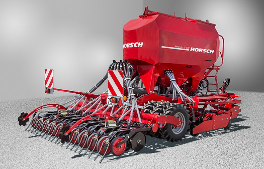
The new style will be introduced for 2015 from machine branding, communication materials, online and training media to dealers resources and show stands.
For more information visit: www.horsch.com.


